Ukraine Regional Response: Needs, Intentions, and Border Crossings
IOM Dashboard, 2024
CLIENT: IOM, UN Migration
DURATION: Feb 2024 to June 2024 (5 months)
Ukraine Regional Response: Needs, Intentions, and Border Crossings
![]()
Introduction
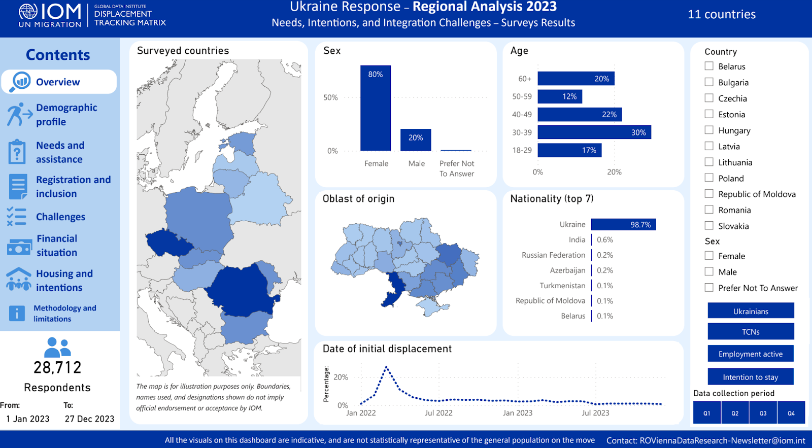
IOM’s Displacement Tracking Matrix (DTM) conducts two major surveys with adult refugees in the Ukraine response region, the Surveys with Refugees and Crossings Back survey. IOM sought to create a dashboard that would provide decision makers access to the data from these surveys.
My Tasks:
Data visualization and chart generation.( R + Tableau.)
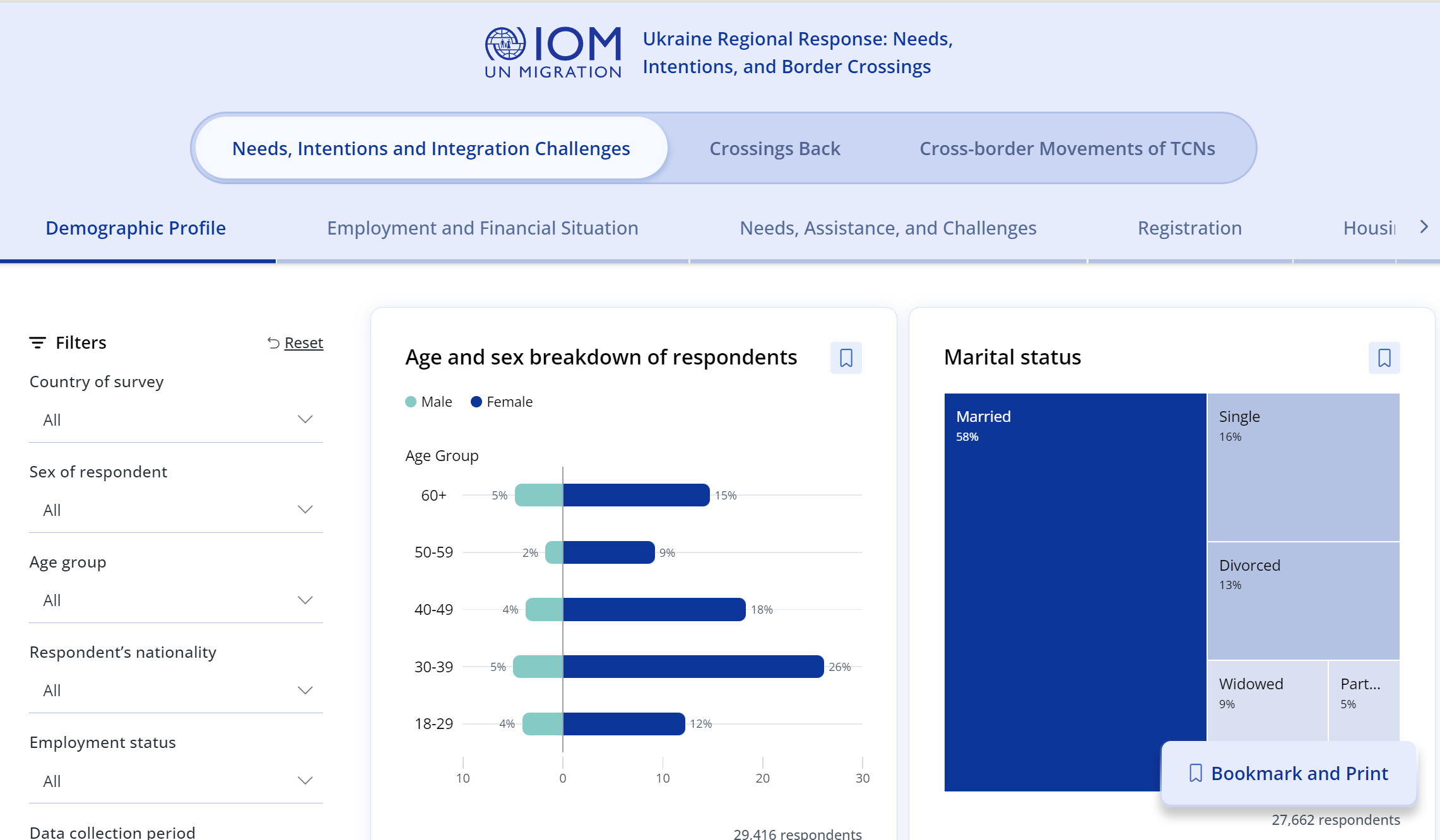
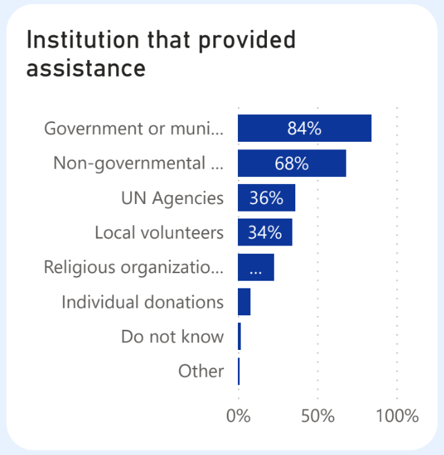
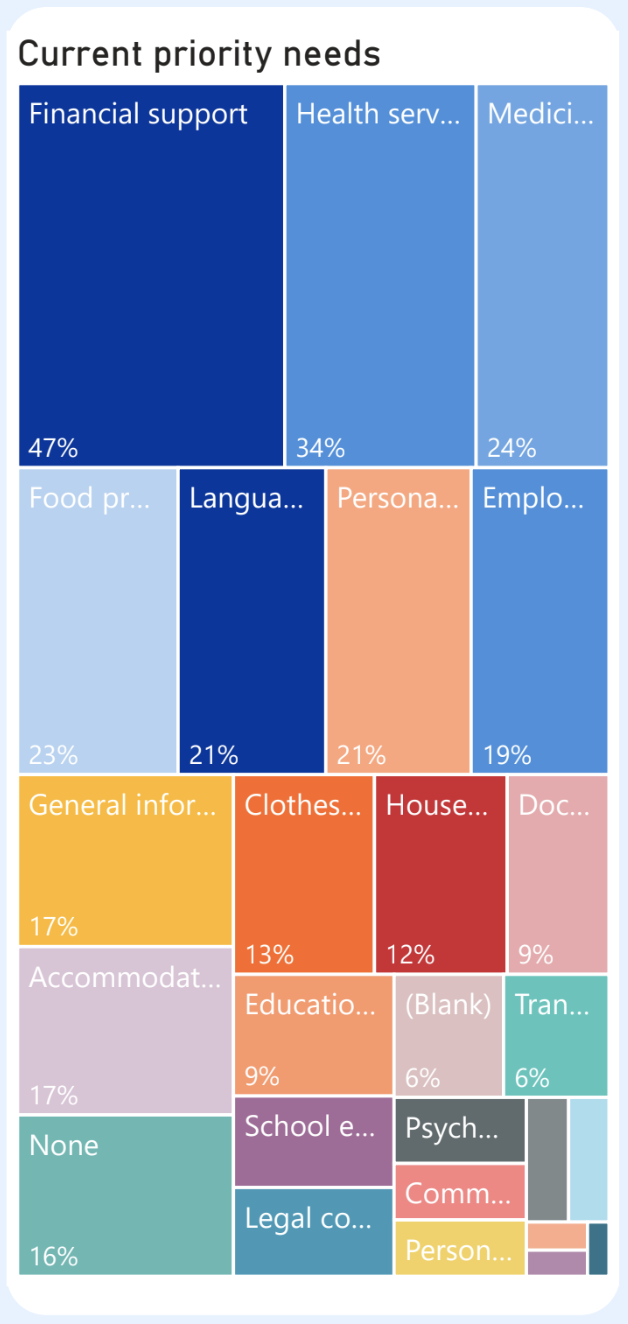
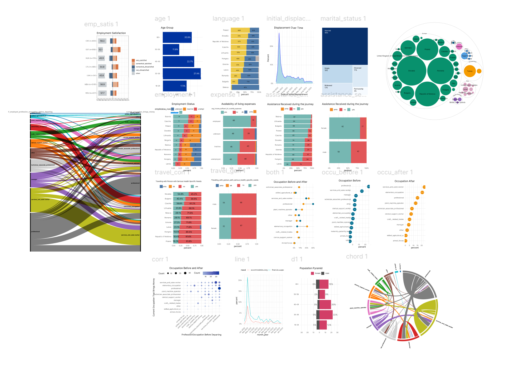
The charts in IOM’s PowerBI dashboards displayed several limitations, such as:
Truncated labels:
Only depicting the top 10 (or in some instances, 5 or 7) categories of an indicator due to a lack of space:
Visualize the survey data through better and well-designed charts that would be free of constraints (such as only depicting the top 10 categories).
Visualize new indicators from recent quarters that were yet to be added to the dashboard.
Key Tasks and Responsibilities:
Analyzed 2 important survey datasets containing 25000+ observations each.
- Data Visualization and Chart Generation:
Created various types of charts to improve the visual representation of data.
Focused on preferred chart types and important indicators to highlight patterns within the data.
- Addressing Limitations in Existing Dashboards:
Resolved issues such as truncated labels that hindered data readability.
Expanded the scope beyond the top 10 categories, accommodating a more comprehensive view of indicators.
- Introduction of New Chart Types:
Developed and implemented charts like the dumbbell chart to depict before and after scenarios.
Created population pyramid charts to represent demographic distributions effectively.
Designed Likert scale charts for nuanced data presentation.
4. Visualization of New Indicators:
Incorporated new indicators from recent quarters that were previously not included in the dashboard.
Ensured that the visualizations were free from the constraints of depicting only a limited number of categories.
Development
Created BAN’S for the Dashboard using Svelte+D3
I contributed to the development of two key Svelte components for the dashboard. These components were designed to display Big Aggregate Numbers (BANs) and were integrated using D3.js in a collaborative environment on GitHub.
- Worked in a collaborative environment on GitHub, ensuring smooth integration and functionality of the components.
- Engaged in code reviews and iterative improvements, leveraging team feedback to enhance the components’ performance and usability.
Outcome:
The improved visualizations provided a more detailed and comprehensive view of the survey data, enhancing the overall effectiveness of IOM’s PowerBI dashboards. These enhancements allowed for better data interpretation and decision-making processes.